Use Card Details → Print Materials to change the card stock and relief. These settings show the visual characteristics of print materials on screen. Check a print shop’s samples for the actual feel and finished result.
Open SSR Card Maker · Getting started
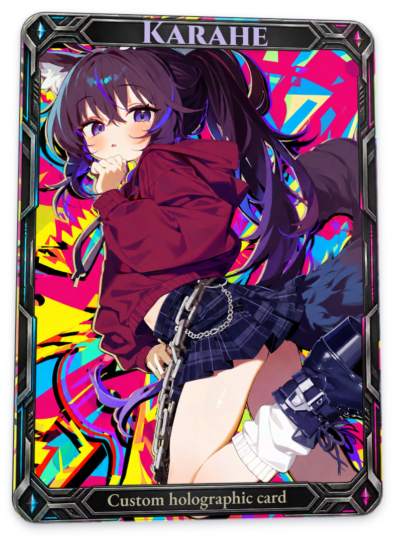
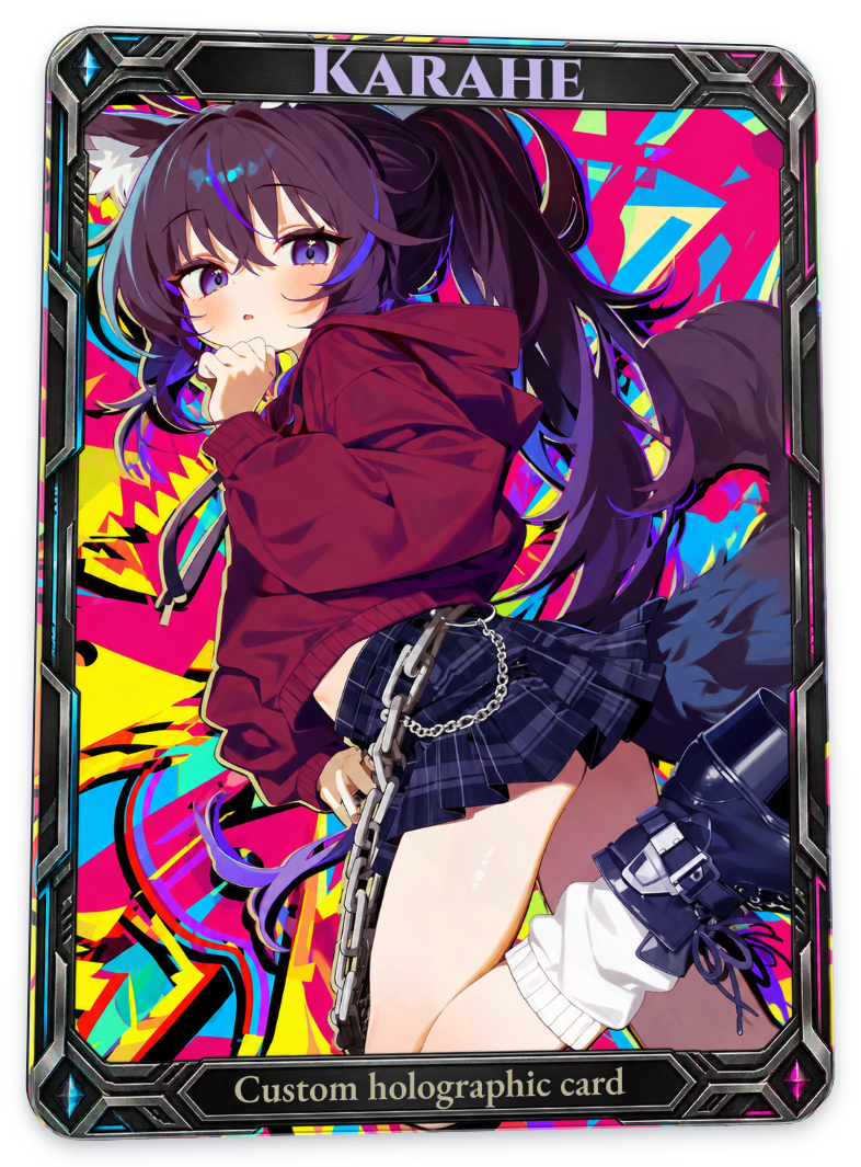
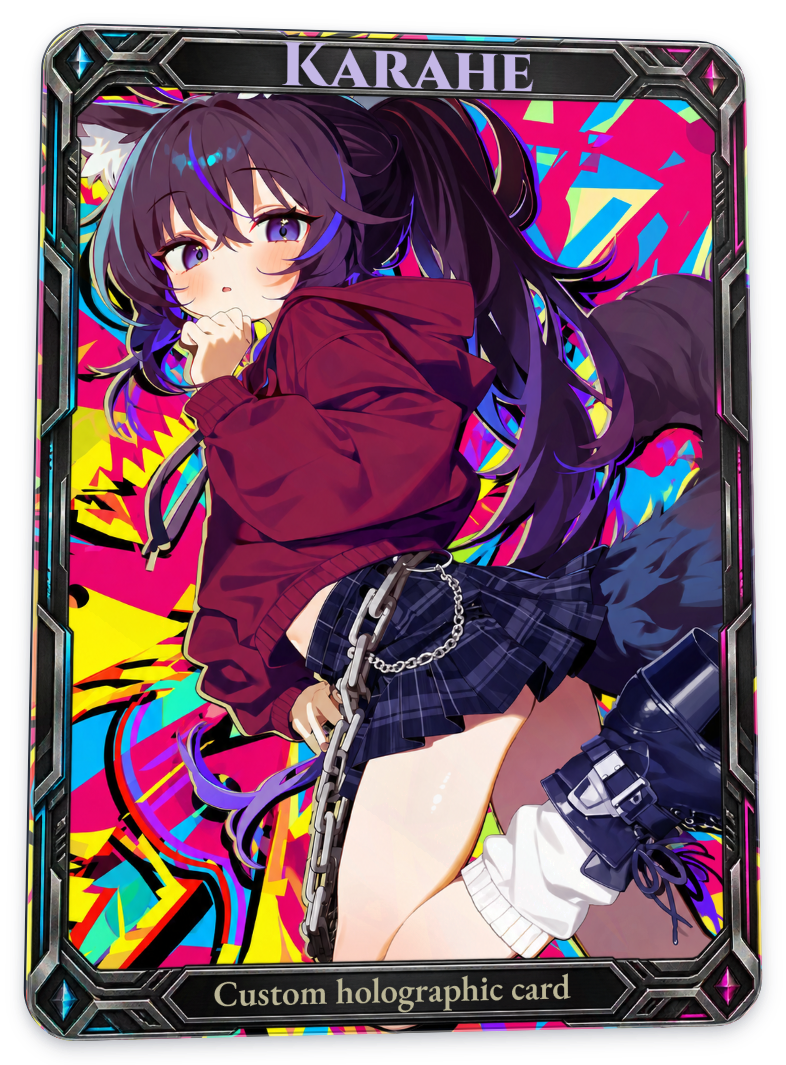
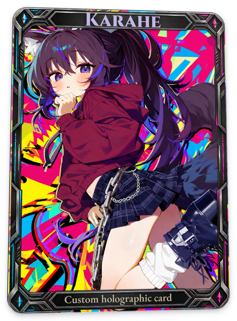
In each close-up comparison, switch between Before / After to inspect the same area. Full-card images appear below. Select an image to view the whole card at a larger size.
The white, black, blue, and gray core stocks, along with white underprint, show only subtle changes in this example. In the close-ups, compare the brightness of the red clothing and the edges of its folds. For linen, look for fine grain across broad areas.
In these tables, Before means the card before the effect being compared was applied. The card already contains the uploaded artwork, frame, and text. Every example uses the same character and background, custom frame, Karahe title, and bottom caption. Layout, font, lighting, and angle stay the same within each table. To make differences easier to see, unrelated effects were disabled, and card stock, white underprint, and relief strength were all captured at 100%. No additional color correction was applied.
Card stock
You can select one card stock at a time. The left side of every table below has no card stock selected.
White core smooth
A bright, smooth paper base. It makes small changes to the base color and reflection rather than substantially changing the artwork’s colors. The difference from the untreated card is subtle in this image.
Full card
| Before | After |
|---|---|
 |
 |
Black core matte
Adds a darker, rougher base. Compare small tonal differences in the dark clothing and hair rather than in the highlights.
Full card
| Before | After |
|---|---|
|
 |
Blue core
A stock setting with a blue-toned base. When artwork fills the card, the change in base color is subtle.
Full card
| Before | After |
|---|---|
|
 |
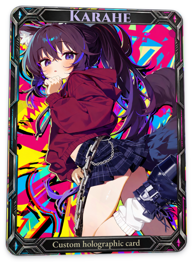
Gray core
Adds a gray-toned base. As with Blue core, the difference is small in these captures. Think of it as choosing a base material rather than making a pronounced color change.
Full card
| Before | After |
|---|---|
|
 |
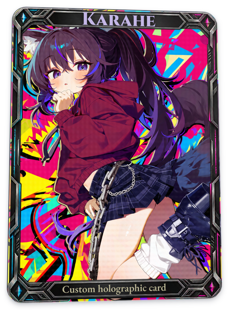
Linen paper
Adds a fine pattern resembling woven fabric. Look for the grain in clothing or backgrounds with even colors. It may be difficult to see in detailed artwork or small images.
Full card
| Before | After |
|---|---|
|
 |
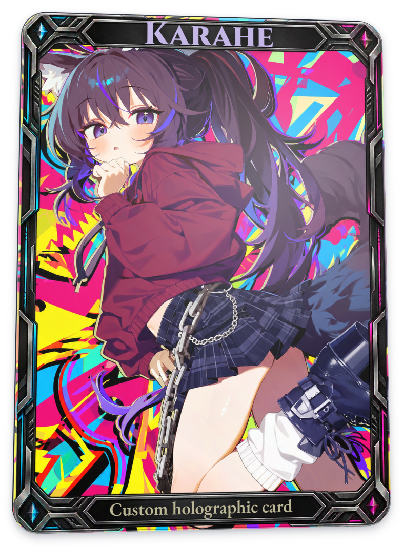
Clear PVC
Simulates the base and reflections of a transparent material rather than paper. Broad, bright reflections are visible at this angle. The background in your uploaded image stays intact.
| Before | After |
|---|---|
|
 |
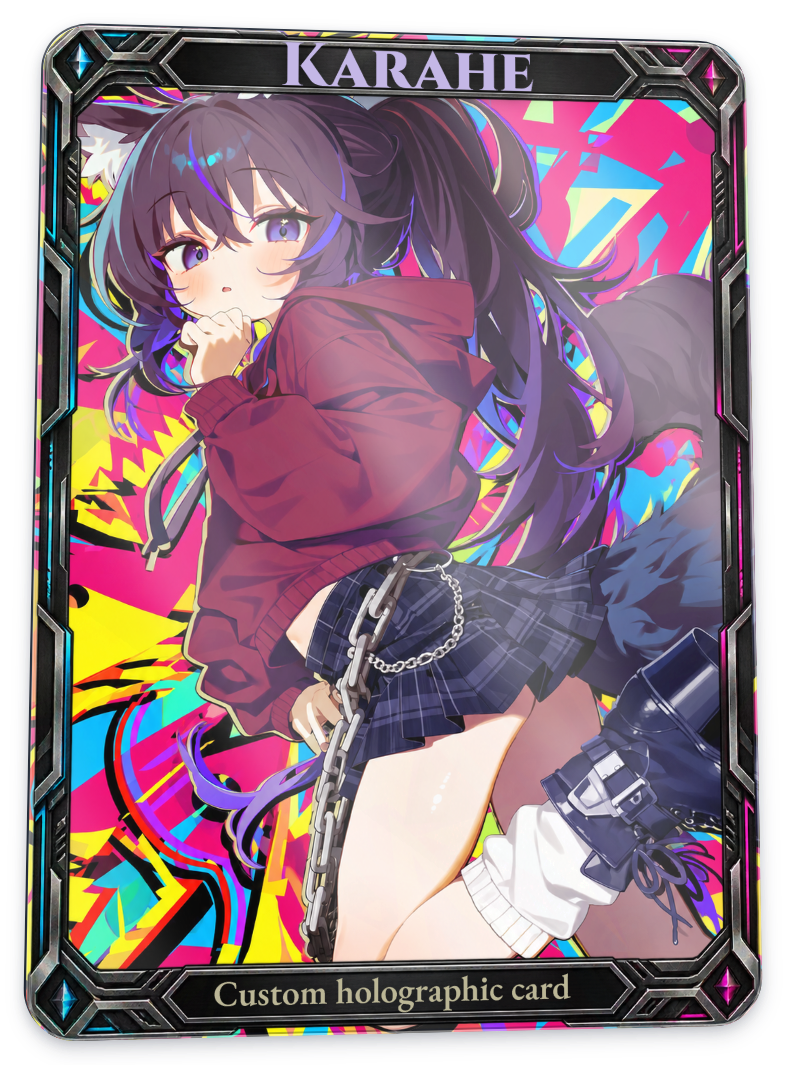
H35 holographic stock
Adds metallic and rainbow reflections to the stock itself, so it reacts even without a separate foil pattern. A still image captures only one angle; move the card in the editor to see the reflected colors change.
| Before | After |
|---|---|
|
 |
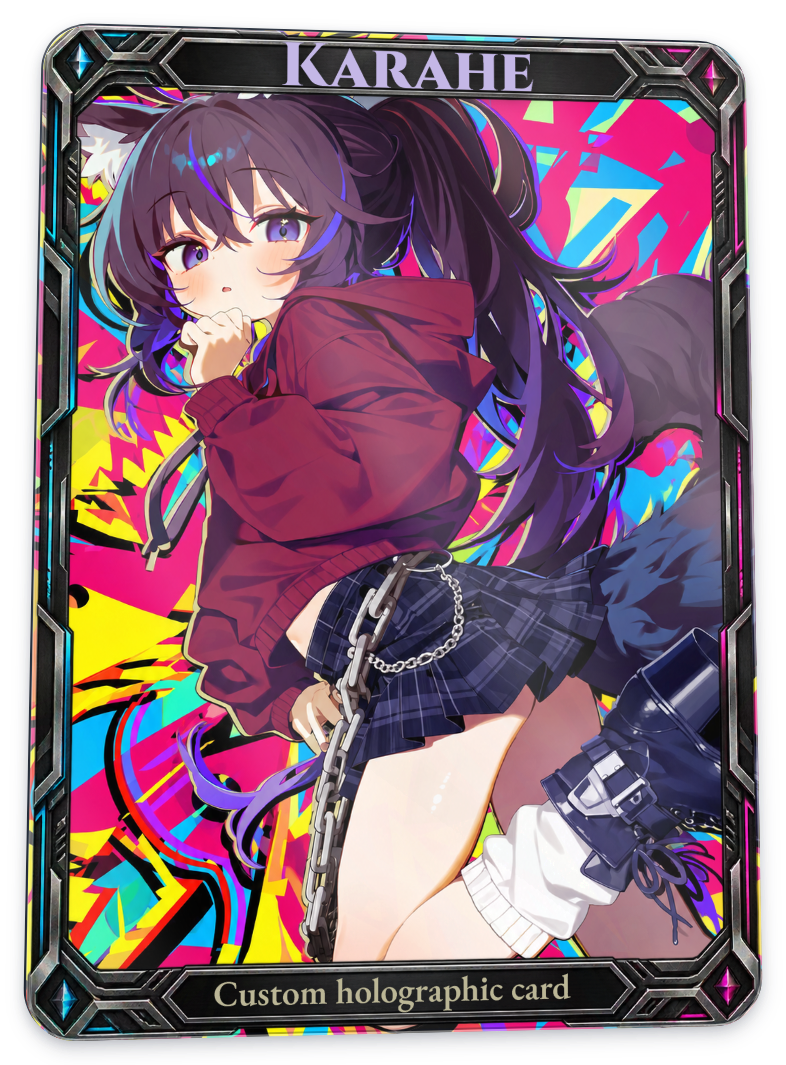
Soft holographic stock
A stock with softly diffused rainbow reflections. Its reflections differ from H35 in strength and spread. In this example, more of the original artwork’s contrast remains than with H35.
| Before | After |
|---|---|
|
 |
White underprint
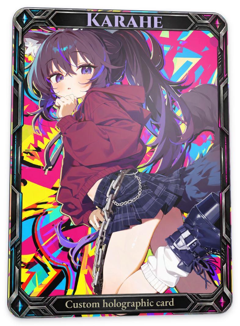
White underprint places a bright base beneath the artwork. In the comparisons below, the card stock stays set to Clear PVC while only the white underprint changes.
Full white underprint
Adds a white base to the selected application areas. Even with ‘Full’ selected, it only affects the areas you choose, such as Character or Background. In this image, the difference was small even at 100%.
Full card
| Before · no white underprint | After |
|---|---|
|
 |
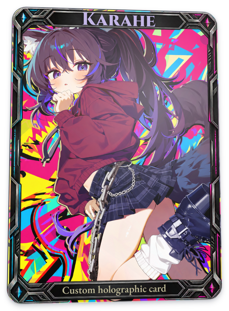
Balanced translucent white
Adds a weaker white base than Full white underprint. The difference is even smaller in these captures. Both options are best understood as base adjustments to use with other materials, rather than effects that dramatically transform the artwork.
Full card
| Before · no white underprint | After |
|---|---|
|
 |
Emboss / Deboss
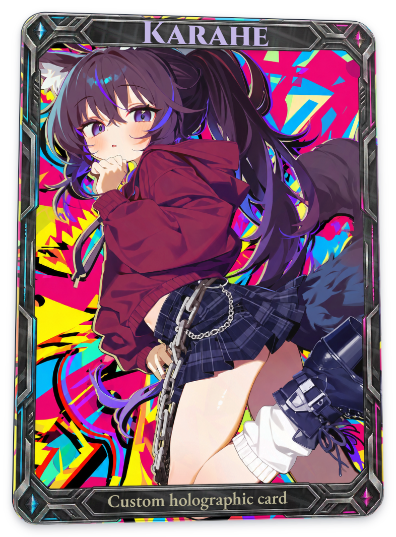
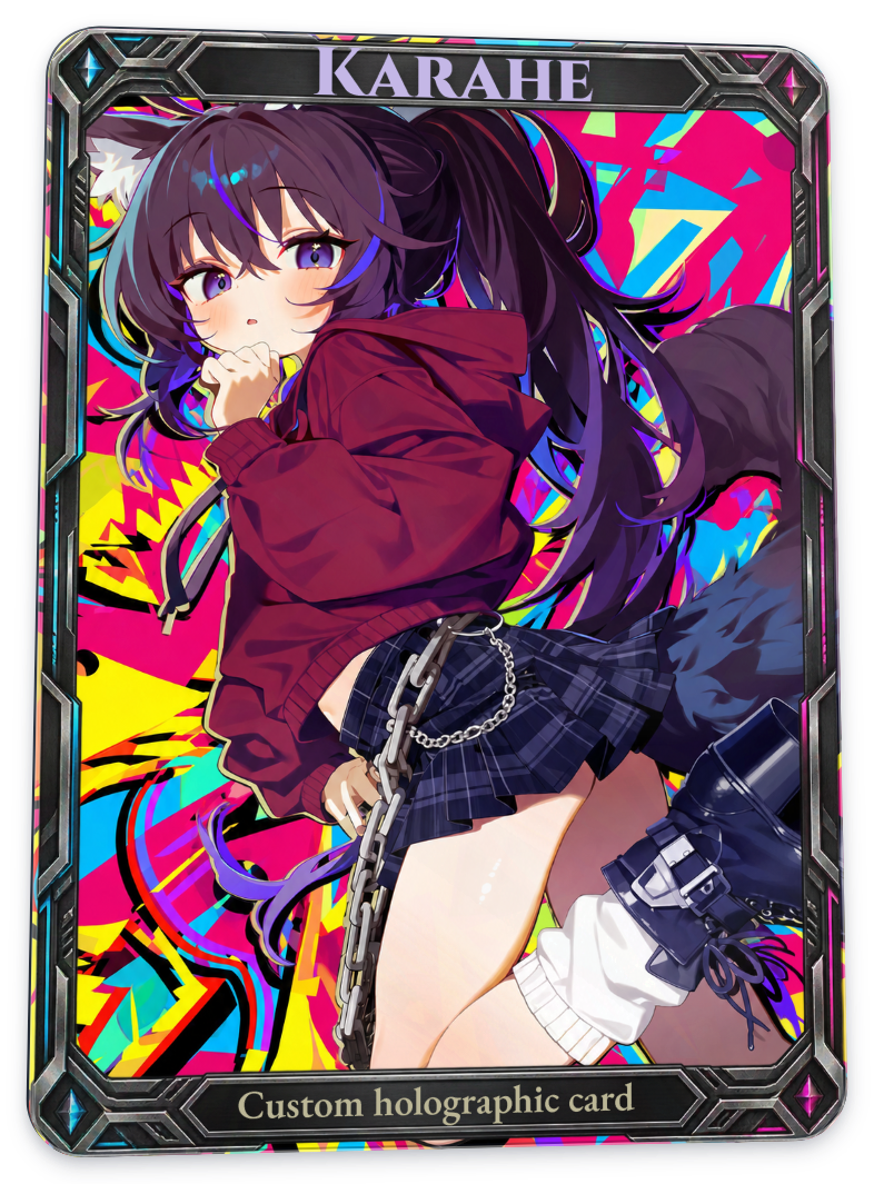
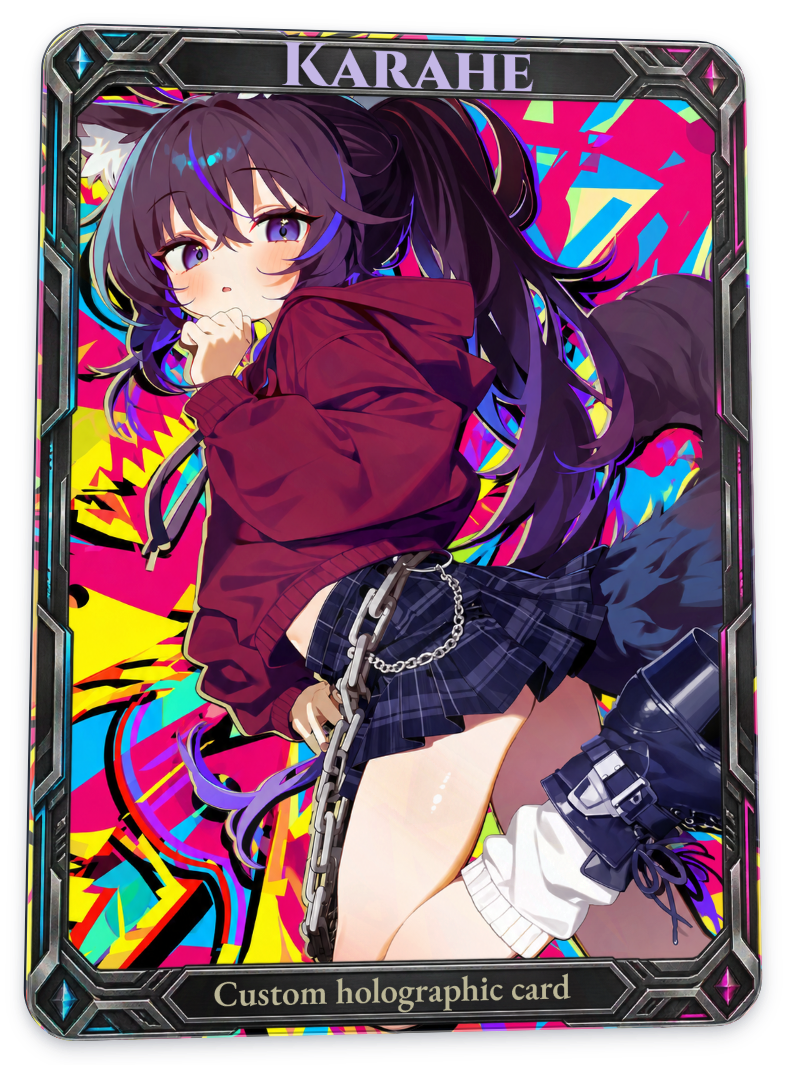
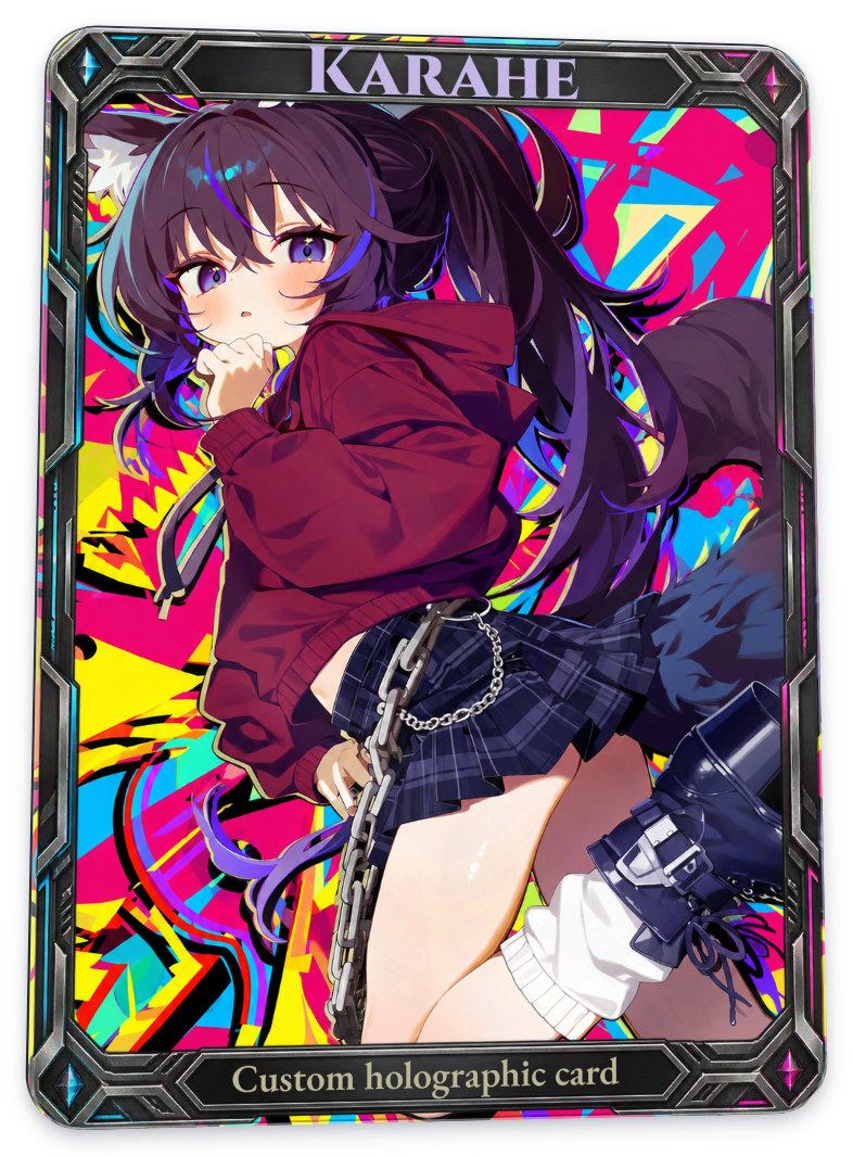
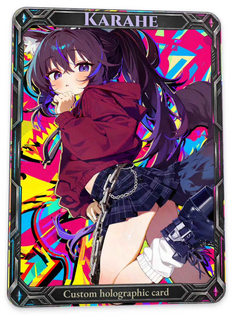
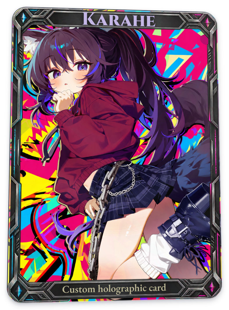
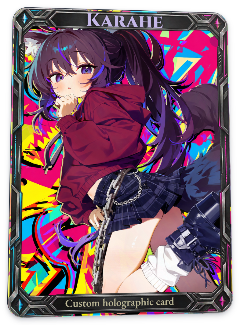
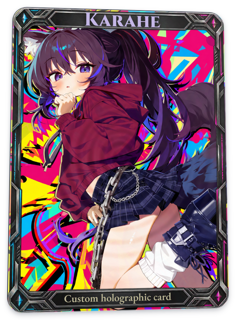
Embossing makes a surface appear raised; debossing makes it appear recessed. Even with the same pattern, the arrangement of lit and shaded faces changes. Here, those differences are represented through shading and reflections on screen.
Switch between No relief / Emboss / Deboss in the close-ups to compare shading in the same area. For the basic patterns, look at surface contours; for the alpha patterns, focus on the character’s outline. The full-card images below show the pattern’s coverage and overall appearance.
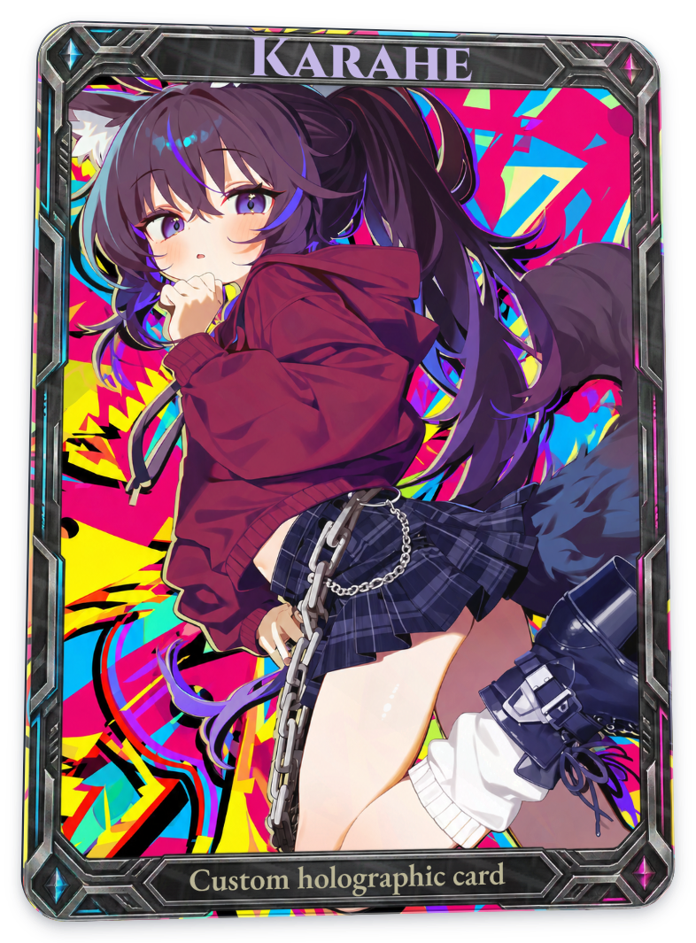
In the editor, choose an emboss or deboss type, then select a Relief pattern. The full-card tables below run No relief → Emboss → Deboss. ‘No relief’ means relief is disabled; it is different from the pattern option named ‘Original’.
The current options are divided into blind and registered types, shown in separate tables below. Registered types have a stronger relief response and different gloss settings than blind types. To follow the character’s shape, also select one of the alpha patterns described later.
Following the settings saved in this card, relief is applied to the character and frame. The background and text are excluded.
Blind emboss and deboss: basic patterns
Original
Full card
| Baseline · no relief | Emboss | Deboss |
|---|---|---|
|
 |
 |
Contour
Full card
| Baseline · no relief | Emboss | Deboss |
|---|---|---|
|
 |
 |
Chevron
Full card
| Baseline · no relief | Emboss | Deboss |
|---|---|---|
|
 |
 |
Radial
Full card
| Baseline · no relief | Emboss | Deboss |
|---|---|---|
|
 |
 |
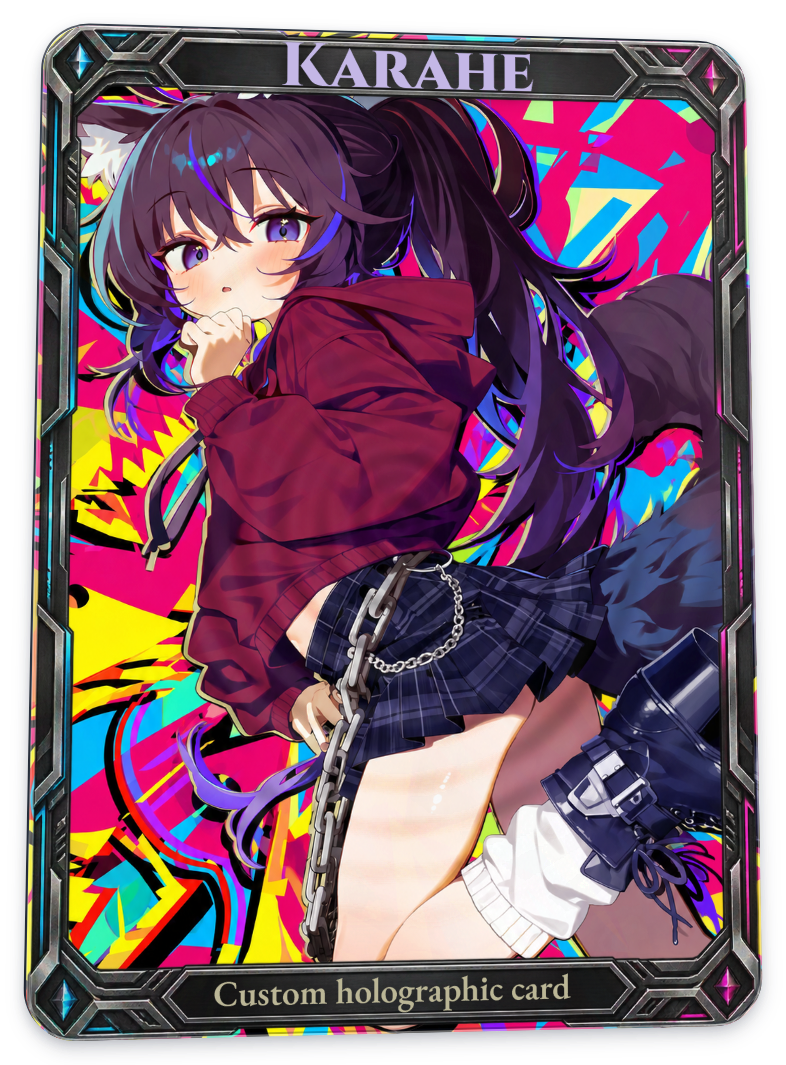
Round relief
Full card
| Baseline · no relief | Emboss | Deboss |
|---|---|---|
|
 |
 |
- Original: the default relief response, with no separate pattern height map selected.
- Contour: gently curving bands of relief.
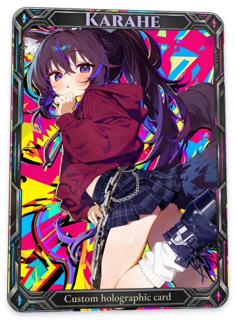
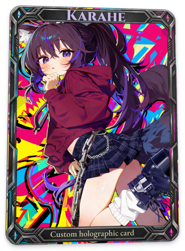
- Chevron: a repeating V-shaped relief pattern.
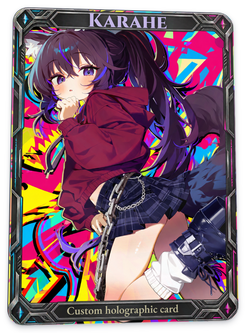
- Radial: relief spreading outward from near the top center of the card.
- Round relief: fine, concentric contours. Detailed artwork can make the pattern difficult to see.
Registered emboss and deboss: basic patterns
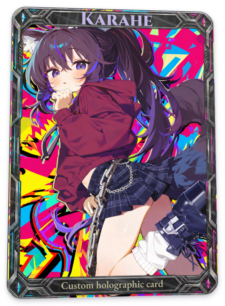
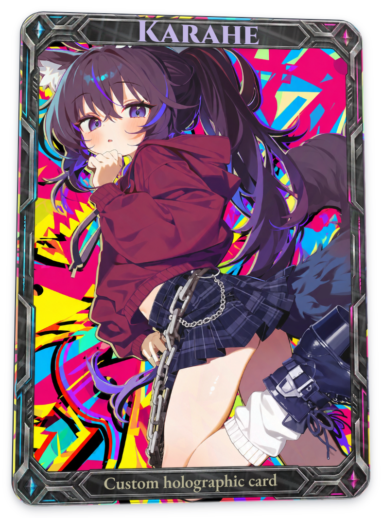
Original
Full card
| Baseline · no relief | Emboss | Deboss |
|---|---|---|
|
 |
 |
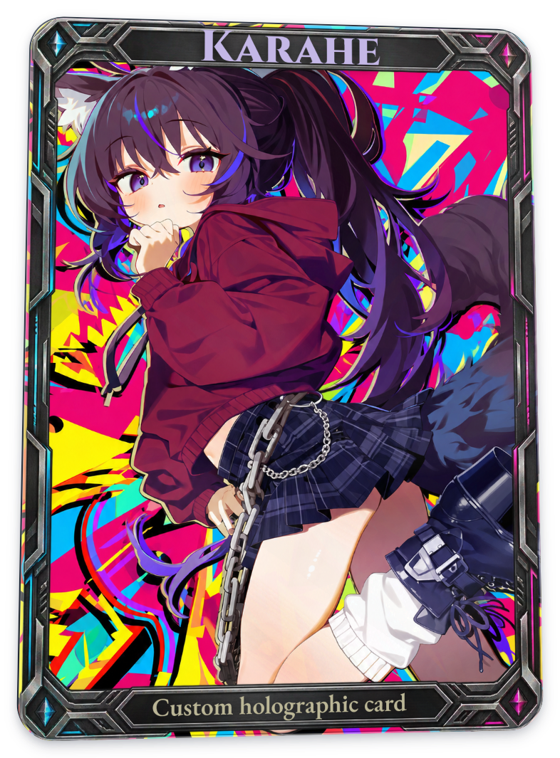
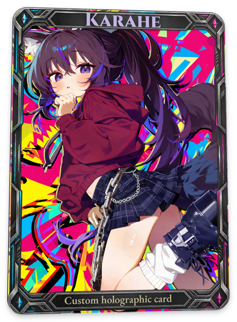
Contour
Full card
| Baseline · no relief | Emboss | Deboss |
|---|---|---|
|
 |
 |
Chevron
Full card
| Baseline · no relief | Emboss | Deboss |
|---|---|---|
|
 |
 |
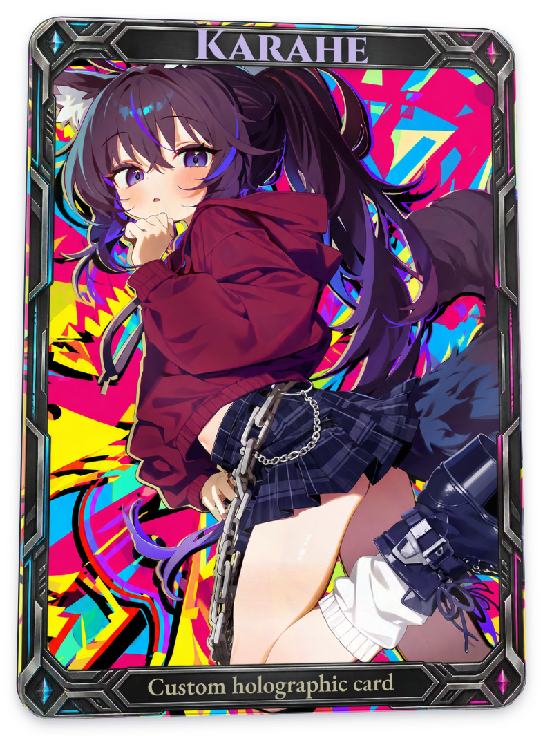
Radial
Full card
| Baseline · no relief | Emboss | Deboss |
|---|---|---|
|
 |
 |
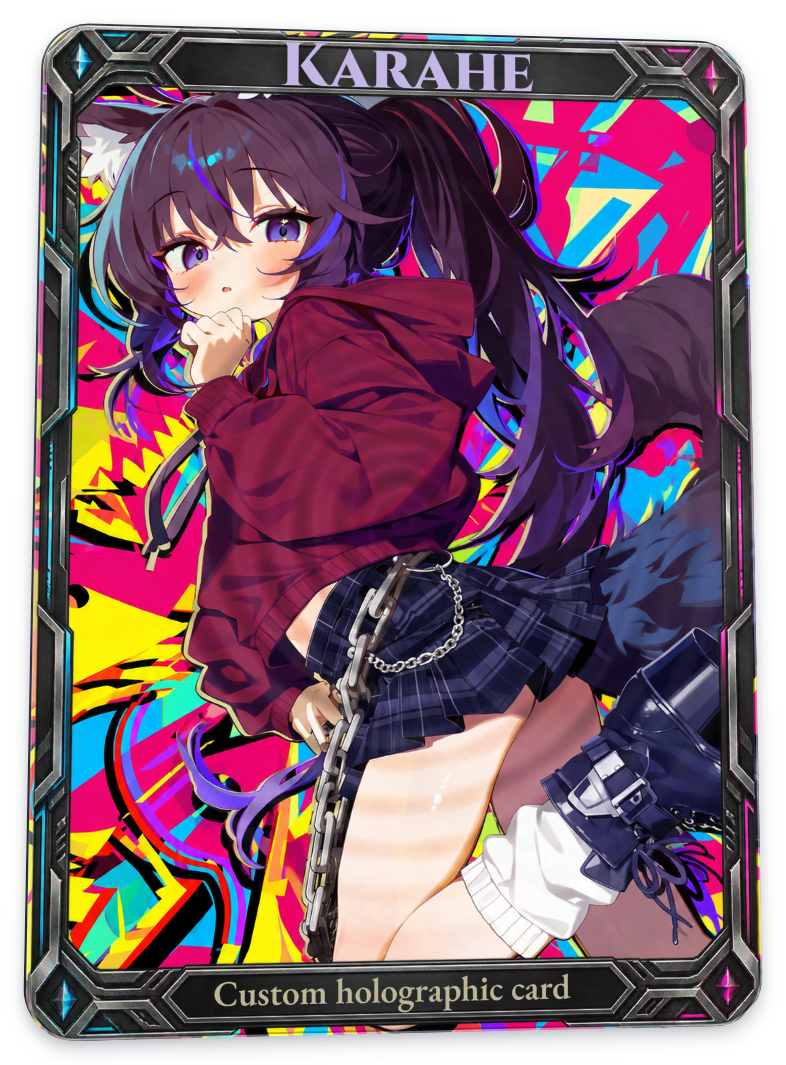
Round relief
Full card
| Baseline · no relief | Emboss | Deboss |
|---|---|---|
|
 |
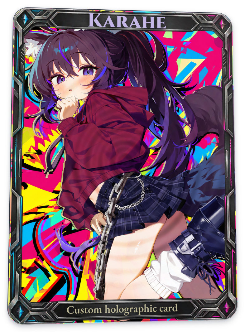 |
The patterns are the same as above, but the response is stronger. Blind and registered types do not produce the same result even at the same 100% setting. To compare only the emboss/deboss direction, look at the two images on the right in the same row.
Relief that follows the character’s shape
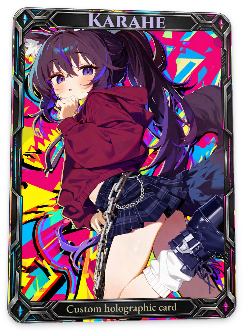
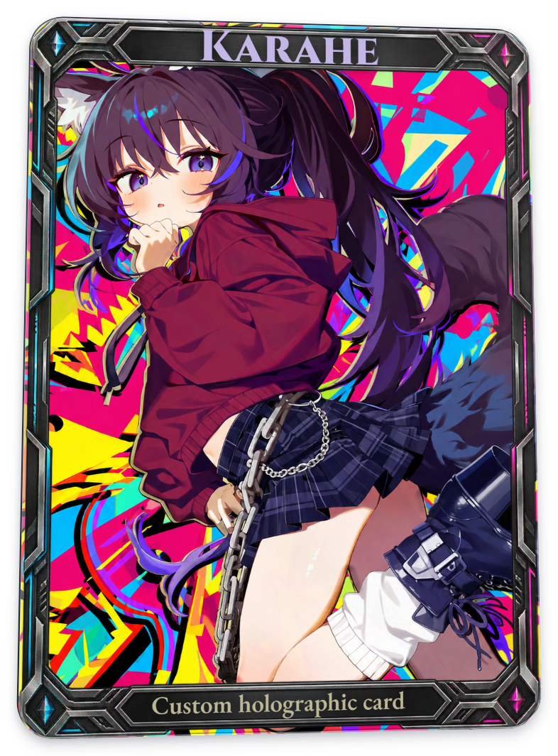
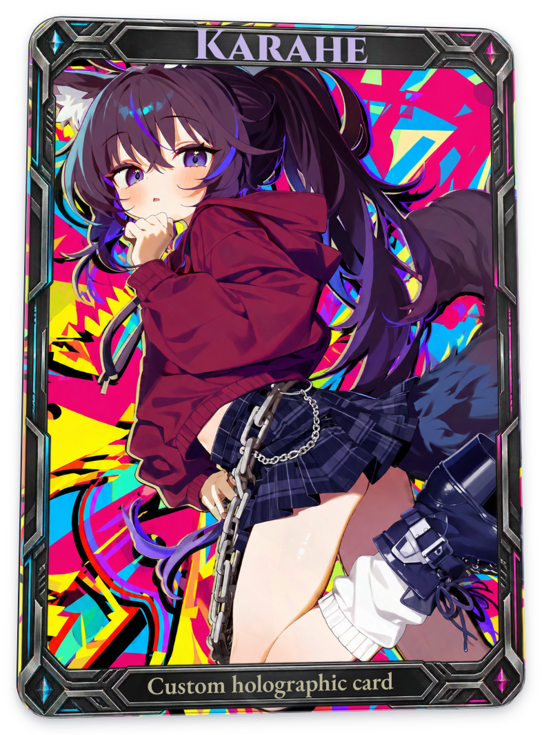
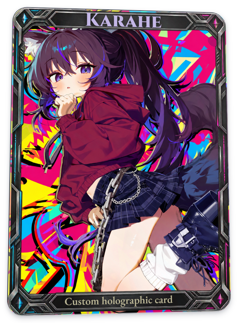
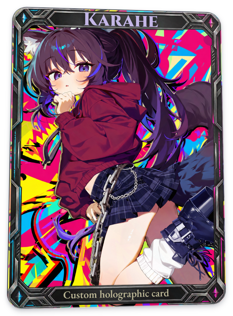
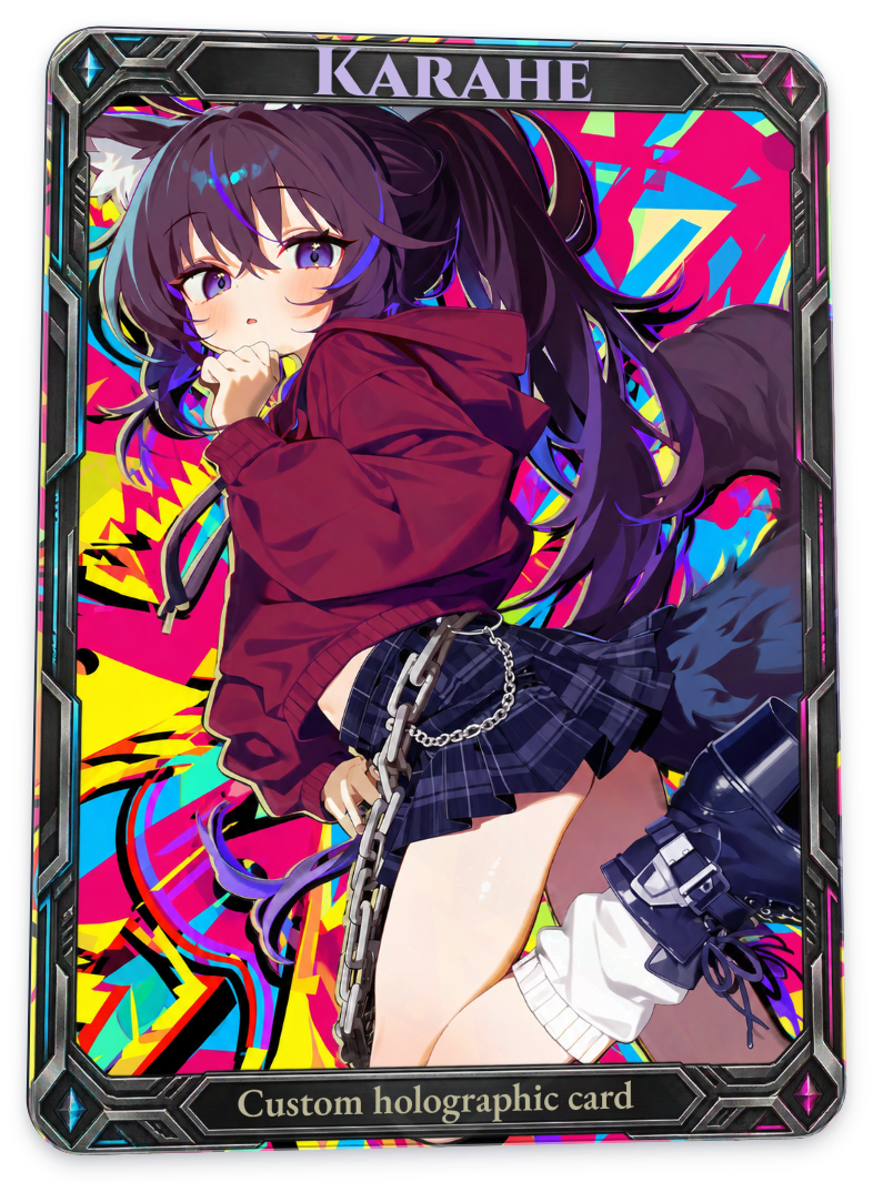
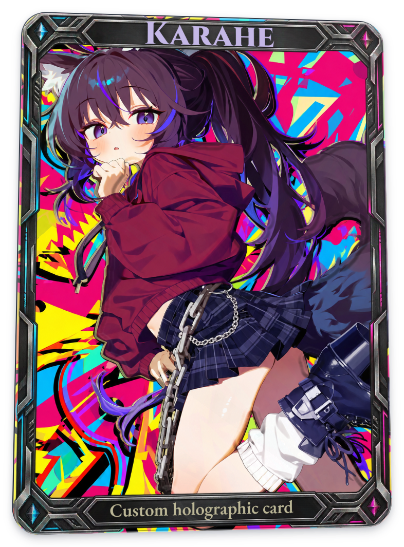
Character silhouette (alpha) and Character inner outline (alpha) use the transparency of the character image to determine the shape. Upload a character file with a transparent background, and add the background separately. If you use a rectangular image with the background already included, that rectangle becomes the reference shape.
This example uses a project with separate character and background images from the start. The untreated images in the tables below and in the basic-pattern tables all show the same card: White core smooth with relief disabled.
Blind types
Character silhouette
Full card
| Baseline · no relief | Emboss | Deboss |
|---|---|---|
 |
 |
 |
Character inner outline
Full card
| Baseline · no relief | Emboss | Deboss |
|---|---|---|
|
 |
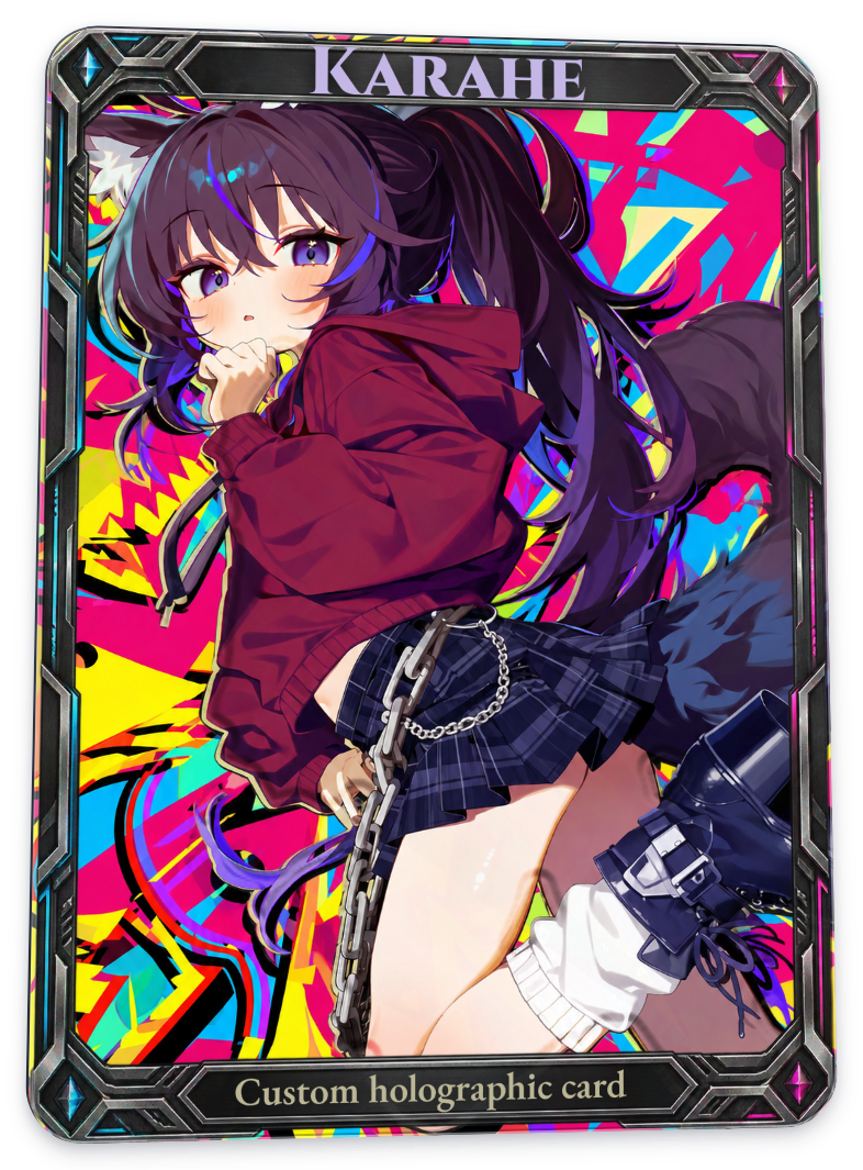 |
Character silhouette treats the character’s opaque area as a single height region, regardless of details in the face or clothing, and creates a response along its sloped edges. Character inner outline adds relief only to a narrow band inside the silhouette.
Registered types
Character silhouette
Full card
| Baseline · no relief | Emboss | Deboss |
|---|---|---|
|
 |
 |
Character inner outline
Full card
| Baseline · no relief | Emboss | Deboss |
|---|---|---|
|
 |
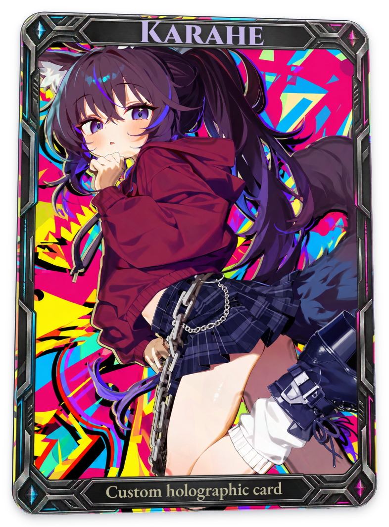 |
These comparisons apply stronger relief and gloss responses to the same character outline. The inner outline creates two boundaries, giving a different impression from the full silhouette. Look at the light and dark areas around the hair and clothing.
Adjusting relief
- Strength: adjusts the relief response. The comparisons above use 100%; the editor’s default is 60%.
- Bevel width: the width over which height changes along the edges of a character alpha pattern. A wider value makes the slope gentler; a smaller value concentrates the change in a narrower area. The comparisons use the project’s saved value of 13px; the editor’s default is 8px.
- Outline width: the width of the character’s inner-outline pattern. The comparisons use the default of 18px.
- Application area: chooses which parts receive the effect: Character, Background, Frame, or Text. If you upload artwork with a combined background into the Character slot, the entire file counts as the character target.
- View effect only / Show areas: lets you inspect the effect separately from the artwork or check its coverage. Both views were disabled for the comparison images above.
If the differences are hard to see in small images, enlarge them or slowly tilt the card in the editor. The most visible details change with the pattern direction and lighting angle.
Related guides
Getting started · Foil · Surface finishes · Light, environment & ink · Text
AI disclosure
Translated with OpenAI Codex using GPT-6 Astra (xhigh reasoning). Reviewed and edited by Yioo.