Select an item under Text items in the Edit view to reveal the Basic Settings, Foil & Light, and Texture & Relief tabs. Each item can have its own settings: a golden title, for example, with an ordinary bottom caption.
Open SSR Card Maker · Getting started
Select a comparison image to enlarge it. On mobile, swipe horizontally within a table if it is wider than the screen.
The comparisons use a card with character and background images plus a custom frame. The title is Karahe, and the bottom caption is Custom holographic card. Each comparison crops the same area, with no color, brightness, or contrast correction. Text effects are easier to see in title close-ups than on the full card.
Before means the card before the setting being compared in that table was changed. The font, color, and layout examples were captured with the text’s separate hologram disabled. The later material examples use different conditions with lighting enabled. Their reference images are distinguished so they are not mistaken for identical settings across tables.
Edit each text item separately
- Select the text item on the left. Use
Add textto create another item. - Under
Basic Settings, set the content, font, text color, position, and size. - For reflective text, enable
Hologram materialunderFoil & Light. - Under
Texture & Relief, choose a surface pattern and Flat, Raised, or Inset geometry.
Hide this text hides only the selected item. Use it for a temporary comparison, or use Delete to remove an unwanted item. The final remaining item cannot be deleted, so hide it if you want a card with no text. Edit the title and bottom caption separately.
Basic Settings
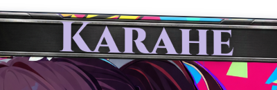
The reference title in this section uses Cinzel at 32px, color #c4b7e6, X position 51%, and Y position 3.8%. These values suit the example card; they are not the defaults when first opening the tool.
Font
| Before · Cinzel | After · EB Garamond |
|---|---|
 |
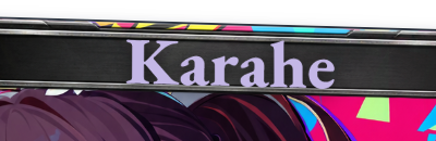 |
Changing only the font changes the width and character of the same text. For a long title, choose the font first, then adjust size and position. This table compares two Latin fonts. Type Korean text yourself to check how it looks.
The list includes the system font, Noto Sans KR, Noto Serif KR, Black Han Sans, Do Hyeon, Jua, Yeon Sung, MaruBuri Bold, Hahmlet, Gmarket Sans Bold, Cinzel, Cabin, Jost, and EB Garamond, among others. When selecting a web font for the first time, wait for it to download before judging its appearance. For a Korean title, try a short phrase such as 나의 첫 카드 (My first card) in Noto Sans KR. Adjust the size so the text fits inside the frame.
Base text color
Before · pale purple #c4b7e6 |
After · yellow #ffe070 |
|---|---|
|
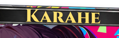 |
This is the text’s own base color, separate from Foil color later in this guide. With the hologram disabled here, only the color change is visible.
Size
| Before · 32px | After · 44px |
|---|---|
|
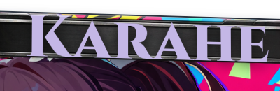 |
After increasing the size, check that the title does not overlap its slot or the frame. Different fonts occupy different amounts of space at the same size.
Position
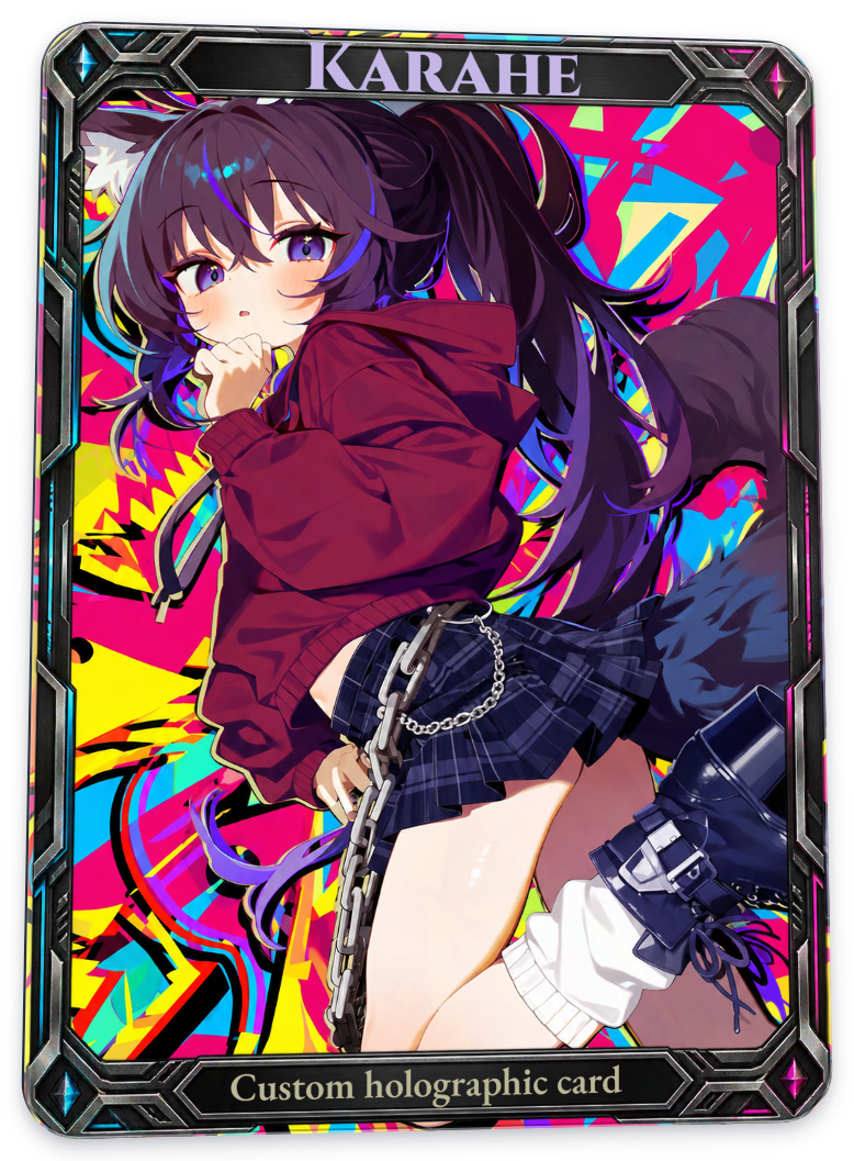
| Before · Y position 3.8% | After · Y position 10% |
|---|---|
 |
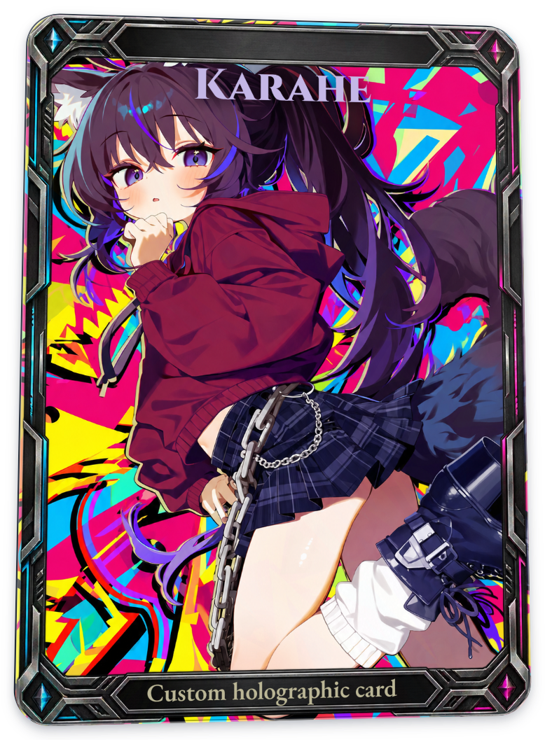 |
Adjust X and Y position to fit the frame’s empty space. The right-hand image demonstrates the movement. Use numeric inputs for fine adjustments, or drag the text in the preview while editing it.
Items linked to the frame’s title or caption slots can use Fit to frame to reset position and size. Items created with Add text have no frame link, so you must adjust their position and size manually. With a custom frame image, check where the text should sit and adjust it accordingly.
Enable Hologram material
From this section onward, the shared conditions are card Reflection pattern strength 80%, Direct glare strength 40%, Daylight, and the Recommended angle. The whole-card surface texture is None, and separate hologram materials for the frame and bottom caption are disabled. Only the title is compared.
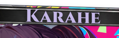
| Before · title hologram off | After · title hologram on |
|---|---|
 |
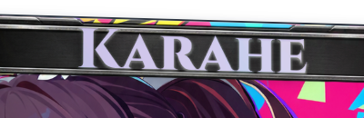 |
The right-hand image uses Flat geometry, Classic Spectrum, Face reflection 100%, Sparkle 70%, and no surface texture. With this combination and angle, enabling it alone makes only a small difference. Look for subtle changes in white reflections and edges.
| Before · no surface texture | After · Contour at 100% |
|---|---|
|
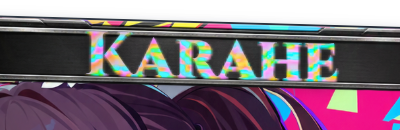 |
Selecting Contour for the same text and raising Texture strength to 100% makes colored reflections inside the letters much clearer. If the sparkle looks weak, check texture, strength, and light position, as well as whether Hologram material is enabled.
Foil color
All palette comparisons below use Flat geometry, Contour 100%, density 100%, angle 0°, Face reflection 100%, and Sparkle 70%. These conditions make color differences visible in a small title; they do not need to be this strong in everyday use. The left-hand images use Classic Spectrum.
Soft Aurora
| Before · Classic Spectrum | After · Soft Aurora |
|---|---|
|
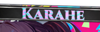 |
A mix of mint, purple, and pink. It changes the impression of reflected colors while keeping the same pattern.
Cosmic Dust
| Before · Classic Spectrum | After · Cosmic Dust |
|---|---|
|
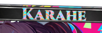 |
Uses purple, teal, and orange tones. Choose the pattern separately under Surface Texture.
Gilded Lattice
| Before · Classic Spectrum | After · Gilded Lattice |
|---|---|
|
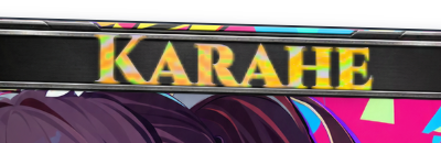 |
Shifts the appearance toward yellow, gold, and warm orange. The golden change is relatively easy to see in this table.
Prism Bloom
| Before · Classic Spectrum | After · Prism Bloom |
|---|---|
|
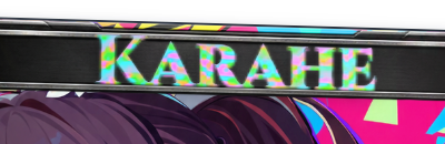 |
Combines pink, cyan, and light green. The colors visible in each letter depend on the light position and texture.
Full Spectrum
| Before · Classic Spectrum | After · Full Spectrum |
|---|---|
|
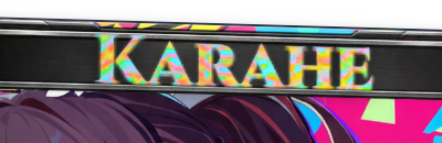 |
A palette to compare when you want rainbow reflections in several primary colors. Regardless of its name, a single still image will not show every color in equal proportions.
Radiant Lines
| Before · Classic Spectrum | After · Radiant Lines |
|---|---|
|
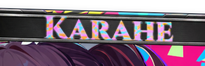 |
A mix of orange, blue, and purple. This is also a color selection; to change the line pattern itself, check Surface Texture.
Relic Wave
| Before · Classic Spectrum | After · Relic Wave |
|---|---|
|
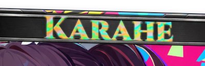 |
Uses yellow-green, teal, and orange. Changing a palette does not change the font or the letters’ outlines.
Energy Flux
| Before · Classic Spectrum | After · Energy Flux |
|---|---|
|
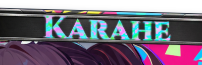 |
A mix of green, blue, and pink. To match the whole card’s reflected colors, choose Inherit card palette instead of a fixed palette. The base text color stays intact.
Silver and Custom color
| Before · Classic Spectrum | After · Silver |
|---|---|
|
 |
| Before · Classic Spectrum | After · Custom color #e8b947 |
|---|---|
|
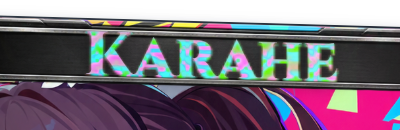 |
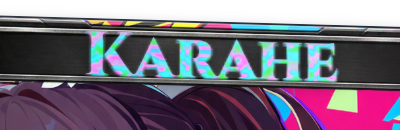
Silver uses silver-toned reflections; Custom color uses a reflection color you choose. However, rainbow colors remain in a combination with strong texture reflections like this one. For a simple text-color change, use Text color under Basic Settings.
Face reflection and Sparkle
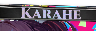
This section compares Contour at 40% strength. The text colors are subtler than in the palette tables, which used 100%.
| Before · Face reflection 25% | After · Face reflection 100% |
|---|---|
 |
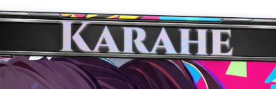 |
Face reflection controls how prominently material reflections appear on the letters. The base text color and opacity stay the same. Sparkle remains at 70% in the table above.
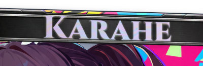
| Before · Sparkle 0% | After · Sparkle 70% |
|---|---|
 |
|
Sparkle controls how prominently bright highlights appear. The difference is small with this title and angle. If it is hard to see in one still image, move the light toward the text to inspect it.
Texture & Relief
Flat, Raised, and Inset
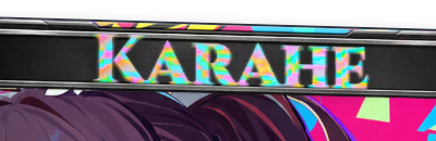
| Baseline · Flat | Raised | Inset |
|---|---|---|
|
 |
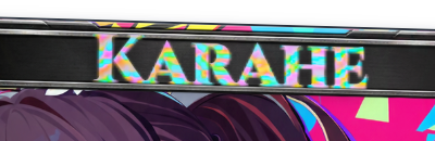 |
Contour strength is 100%. Raised and Inset use Relief depth 100% and Wall softness 42%. Those two relief settings do not apply to Flat geometry. Raised and Inset simulate edge responses for protruding and recessed letters. Unlike Emboss / Deboss under Print Materials, which applies to the card, these follow the shape of the selected text.
At this title size, the three results differ only slightly, and strong color patterns can hide changes at the edges. Tilt the card and look at the directions of light and shade along the letters.
Relief depth and Wall softness
To adjust these settings, enable Hologram material and choose Raised or Inset. They are disabled for Flat geometry.
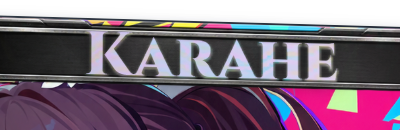
| Before · Inset depth 25% | After · Inset depth 100% |
|---|---|
 |
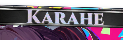 |
This comparison uses Contour at 40% strength. Depth controls the visual response of the relief shown on screen.
| Before · Wall softness 42% | After · Wall softness 100% |
|---|---|
|
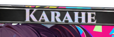 |
Controls how smoothly light and shadow transition along the letters’ edges. Differences are subtle on small text, so enlarge the title or move the light to judge them.
A separate surface texture for text
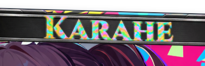
| Before · Contour | After · Chevron |
|---|---|
|
 |
| Before · Contour | After · Radial |
|---|---|
|
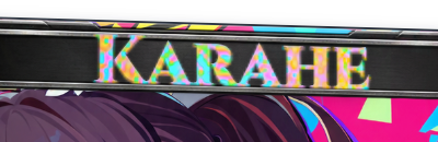 |
All use Texture strength 100%. You can give only the title a different texture from the whole card. Because letters cover a narrow area, the texture may look like small fragments of reflection rather than the broad pattern seen across the card.
Inherit card texture follows the whole-card texture; None disables that surface pattern on the letters. Use Upload texture to add a new texture.
| Before · Contour 40% | After · custom texture 40% |
|---|---|
|
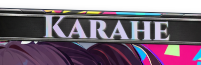 |
The right-hand image uses the custom texture Satin-Weave, restored from the project ZIP.
Strength, density, and angle
| Before · Texture strength 40% | After · Texture strength 100% |
|---|---|
|
|
Strength makes a large difference on this card. If the letters become too busy to read, try lowering Texture strength before changing the foil color.
| Before · density 100% | After · density 200% |
|---|---|
|
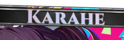 |
Density changes how tightly the pattern repeats. This table uses 40% strength, so the change is subtle. Higher density can make the pattern excessively fine on small text.
| Before · angle 0° | After · angle 90° |
|---|---|
|
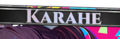 |
This angle changes the direction of the surface pattern. The text and card keep their orientation. Adjust the light band’s direction with Reflection band angle in the Foil menu.
Final checks
- Return to the full-card view and check that both title and caption are readable.
- Compare text color, foil color, and surface texture one at a time rather than changing all three together.
- Enable
Hologram materialto adjust textures. To adjust Relief depth and Wall softness as well, also select Raised or Inset. - To save the reflections you saw in the editor, check the PNG export angle or front-facing light-sweep position too.
- Keep a ZIP containing the project information if you want to edit the text later. Text in a PNG does not remain an editable text item.
The relief and reflections in this guide are digital representations. Check a print shop’s samples for the actual color and depth of gold or silver foil and debossed printing.
Related guides
Getting started · Print materials · Foil · Surface finishes · Light, environment & ink
AI disclosure
Translated with OpenAI Codex using GPT-6 Astra (xhigh reasoning). Reviewed and edited by Yioo.